Case Study - Ben&Frank, Configurator Redesign
Context
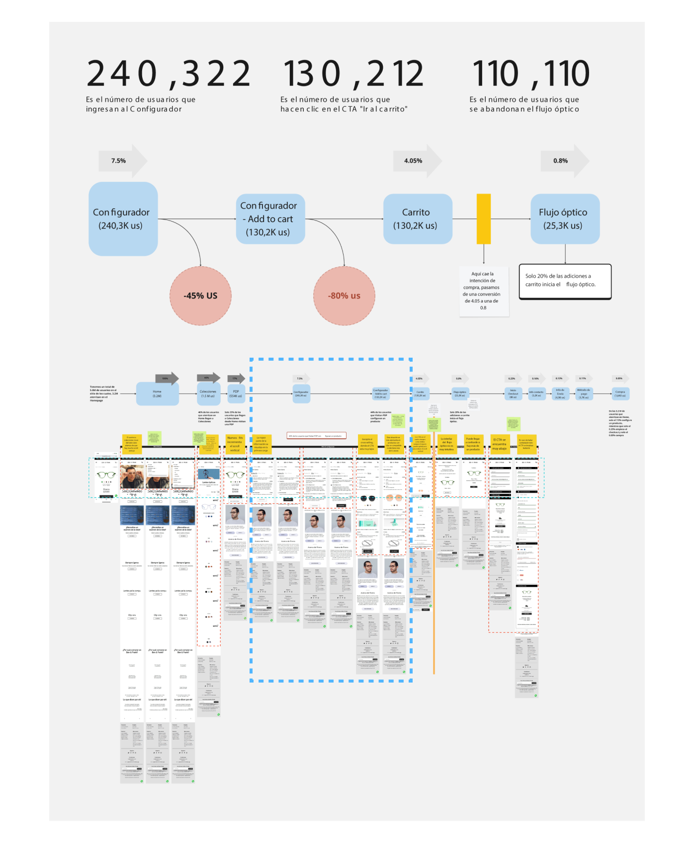
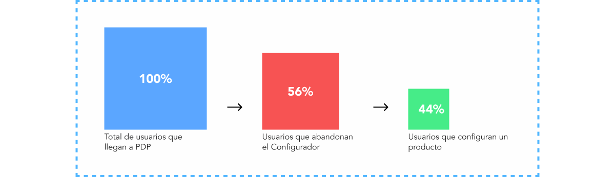
Based on the results of the Foundational Research conducted between the Design and Data Analysis teams, we identified that the Configurator was one of the priority modules due to its 66% abandonment rate, as only 44% of users who visited the PDP configured a product.
Therefore, the project's goal was to increase micro-conversions, which required conducting complementary research to help us better understand the phenomenon.
My role was that of a Product Designer, and I was responsible for leading the project by creating a work plan, executing activities for each stage of the design process, involving key stakeholders, presenting the project to leading stakeholders, and providing the necessary documentation for handoff to PM, Frontend, and Q&A. Throughout the project, I adhered to the Design Thinking methodology and used Zendesk's triple diamond framework.
This project included a particular challenge: during the design process, a Business request was made to include a new product under the "Graduation" tab, which we successfully accomplished.
Empathy & Definition
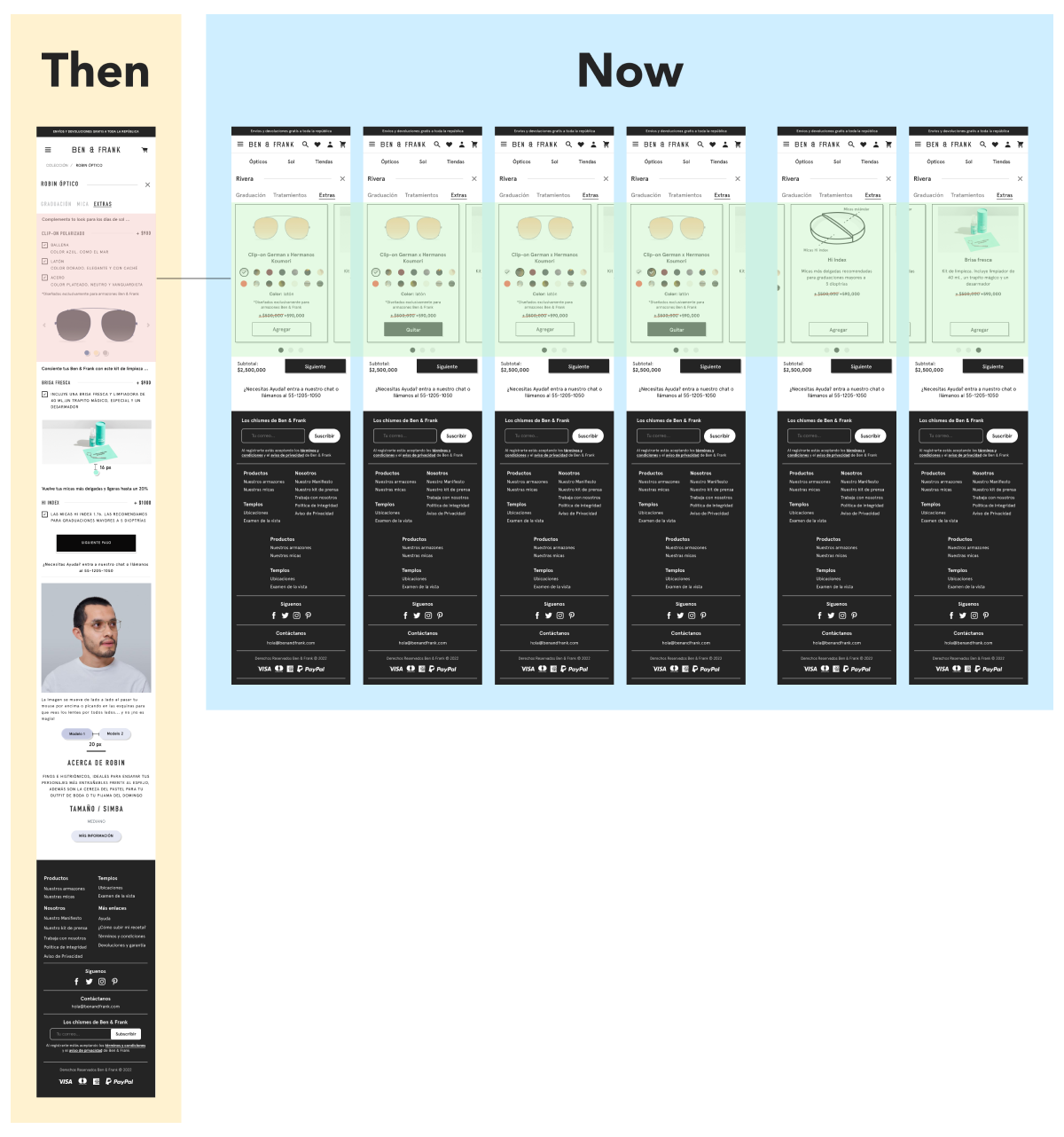
One of the biggest challenges I faced at Ben & Frank was that the site had not been modified in seven years and was largely based on a Shopify platform template, which led to multiple issues:
At the layout level, it hindered the scalability of the product, especially in two of the three business units (Chile and Colombia).
The information architecture could be significantly improved since, at one point, this module functioned as a PDP modal.
The modal was removed to make way for a dynamic page that combined elements of the PDP with the configurator, resulting in a long scroll.
Additionally, the business opted for quick and well-calculated iterations. With all this in mind, to optimize the purchase funnel, I proposed a straightforward (though not simple) strategy that involves reaching industry standards by conducting user-focused functional and competitive research. The goal was to identify the best practices currently used by competitors that we could adopt, based on user feedback as well as external data collection.
Some of the key points from consulted studies include:
- It is estimated that a person’s scanning time is 2.6 seconds.
- Only 1 in 15 users is able to locate information that is not highlighted on the site.
- All users view 100% of the images on a web page.
- The web is more often a place for consultation rather than for long readings.
- The average time a user spends on a website is 53 seconds.
- People remember 80% of what they see, compared to 20% of what they hear and 10% of what they read.
- If written information is combined with a relevant image, there is a 65% chance that the user will remember it later.
- Images are processed 60,000 times faster than text.
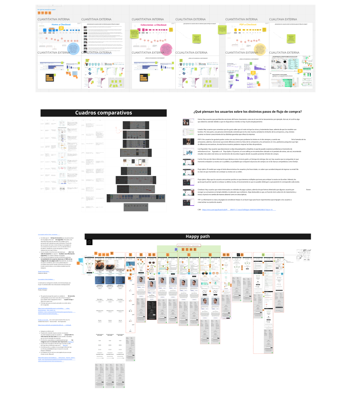
The complementary research consisted of an industry-level data search, as well as a functional and competitive analysis in which I analyzed 10 products, including our own. Additionally, I incorporated the findings identified in the foundational research. This comparison was summarized in a couple of comparative charts and scrollable comparative slides, which helped us identify the following issues:
- There is no summary indicating the total cost of the user's selection.
- The interactions do not align with market standards.
- There are no visual aids to help users understand potentially complex variables.
- There is no use of a sticky bar to keep the "Continue" CTA always visible.
- The CTAs are often outside the initial viewport.
- Descriptions are too long and often repetitive.
- There is no color indicator for the selected product.
- The selected product's photo does not remain visible.
- The cross-selling product cards have too much space between them, and the area they occupy is not optimized.
- Products with many color options result in a large list, causing:
- The CTA to be placed too far down the scroll.
- The reference image to not always be visible because it is located too far down the scroll.
Additionally, we identified that the metric was not sufficiently accurate, as the event profile being quantified primarily consisted of the tool's default configuration. This led the Data Analysis department to define new events to better understand the user.
At the layout level, it hindered the scalability of the product, especially in two of the three business units (Chile and Colombia).
The information architecture could be significantly improved since, at one point, this module functioned as a PDP modal.
The modal was removed to make way for a dynamic page that combined elements of the PDP with the configurator, resulting in a long scroll.
Additionally, the business opted for quick and well-calculated iterations. With all this in mind, to optimize the purchase funnel, I proposed a straightforward (though not simple) strategy that involves reaching industry standards by conducting user-focused functional and competitive research. The goal was to identify the best practices currently used by competitors that we could adopt, based on user feedback as well as external data collection.
Some of the key points from consulted studies include:
- It is estimated that a person’s scanning time is 2.6 seconds.
- Only 1 in 15 users is able to locate information that is not highlighted on the site.
- All users view 100% of the images on a web page.
- The web is more often a place for consultation rather than for long readings.
- The average time a user spends on a website is 53 seconds.
- People remember 80% of what they see, compared to 20% of what they hear and 10% of what they read.
- If written information is combined with a relevant image, there is a 65% chance that the user will remember it later.
- Images are processed 60,000 times faster than text.
The complementary research consisted of an industry-level data search, as well as a functional and competitive analysis in which I analyzed 10 products, including our own. Additionally, I incorporated the findings identified in the foundational research. This comparison was summarized in a couple of comparative charts and scrollable comparative slides, which helped us identify the following issues:
- There is no summary indicating the total cost of the user's selection.
- The interactions do not align with market standards.
- There are no visual aids to help users understand potentially complex variables.
- There is no use of a sticky bar to keep the "Continue" CTA always visible.
- The CTAs are often outside the initial viewport.
- Descriptions are too long and often repetitive.
- There is no color indicator for the selected product.
- The selected product's photo does not remain visible.
- The cross-selling product cards have too much space between them, and the area they occupy is not optimized.
- Products with many color options result in a large list, causing:
- The CTA to be placed too far down the scroll.
- The reference image to not always be visible because it is located too far down the scroll.
Additionally, we identified that the metric was not sufficiently accurate, as the event profile being quantified primarily consisted of the tool's default configuration. This led the Data Analysis department to define new events to better understand the user.
Existing Knowledge
Ideation & Prototyping
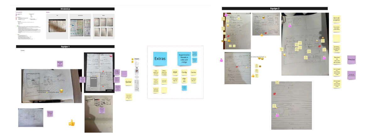
I began the ideation phase with a series of preliminary wireframes that addressed most of the identified areas of opportunity and defined an ideal product.
The next step was to conduct a brainstorming session with the entire squad. I started the workshop by sharing the findings with the squad to provide context to the entire team. The next item on the list was to evaluate the features based on an effort scale, which allowed us to define the structure of the Minimum Viable Product (MVP) and we took the opportunity to have a Crazy 8s session.
- Simplify text and optimize the layout to reduce scrolling.
- Use “two-click” interactions, one to select a variable and another to advance in the flow.
- Include a sticky bar that contains the “Continue” CTA and the total cost summary.
- Include visual aids that enhance user comprehension in both portrait and landscape versions.
- Optimize recommendations in the final step to reduce vertical scrolling.
- Remove content related to the PDP.
- Integrate elements to achieve consistency and uniformity.
The next exercise was mapping the scenarios faced by users in each Business Unit to define the edge case and use it as the basis for conceptualizing the wireframes.
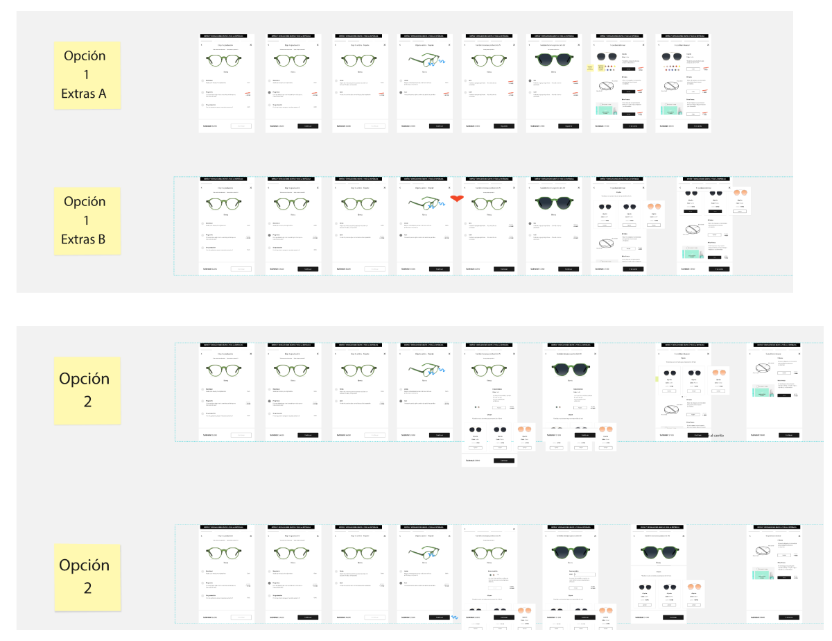
Preliminar wireframes - Ideal product
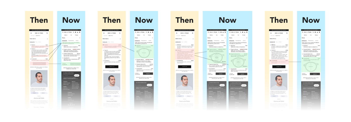
Optical Prescription Tab
The Optical Prescription tab contained the following options: Monofocal, Progressive, and No Prescription. Each option included a title, price, and a description.The pricing often caused issues in two of the business units because, during discount seasons, the original price appears crossed out with the discounted price displayed next to it.
This was not an issue in Mexico, where prices typically consist of four-digit numbers. However, in Chile and Colombia, where prices often have six digits, this caused the price to split into two lines, increasing the scroll length because the structure of the component was not optimized for numbers of that length.
To solve this, I decided to maintain the font weight (Black) and chose a smaller font size, ensuring that the Information Architecture remained intact and the layout did not undergo severe changes.
Another element that caused excessive scrolling was the descriptions, which were redundant. In the case of progressive lenses, the body of text was especially long.
To address this, the first thing I did was identify the text that was repeated across all options and turned it into a disclaimer. Then, I created proposals with simplified, clear, and direct wording that summarized the content, allowing all options to be visible upon the first load. These proposals were reviewed and adjusted by the Marketing department.
Additionally, the landscape version rendered images that helped users understand each option, but this feature was not present in the portrait version, which posed a significant issue since more than 90% of users were on mobile devices.
Because of this, I decided to enhance the diagrams in the landscape version and incorporate them into the portrait version. Multiple proposals were explored to achieve this, all of which presented challenges, as it became evident that the data structure needed to be modified to facilitate the user journey.
To avoid creating a learning curve for users, we decided to maintain the radio button select and developed a variant with an accordion behavior, designed to display a diagram based on the user's selection.
The new diagrams were created based on the actual spectrographs of the lens prescriptions and were subsequently validated by the responsible department.
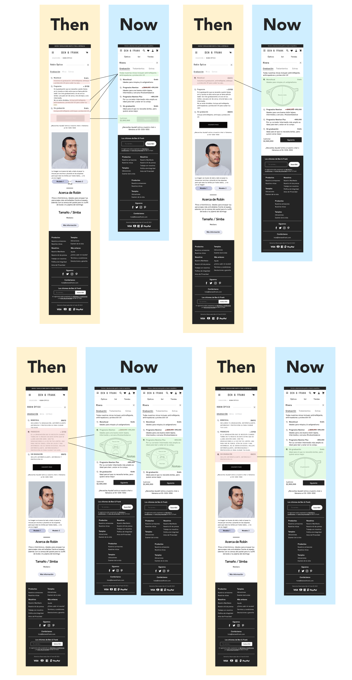
Prescription Tab
Treatments Tab
The Treatments tab had almost the same issues as the previous tab. The texts were also simplified, and I designed a couple of graphic elements that made it easier to understand the variables. We decided to use the same accordion component.
There was an unintuitive interaction where, to choose the photochromic option, the user first had to select an anti-reflective option, and then choose the Photochromic variable. This would then display two more options, one of which the user had to select. Additionally, I included a GIF that clearly shows the user how photochromic lenses work.
To eliminate this unintuitive behavior, I created an option where only the anti-reflective options are initially displayed. The user selects one of them, and the corresponding diagram automatically expands, along with the content for the photochromic treatment, resulting in a simpler and more straightforward sequence.
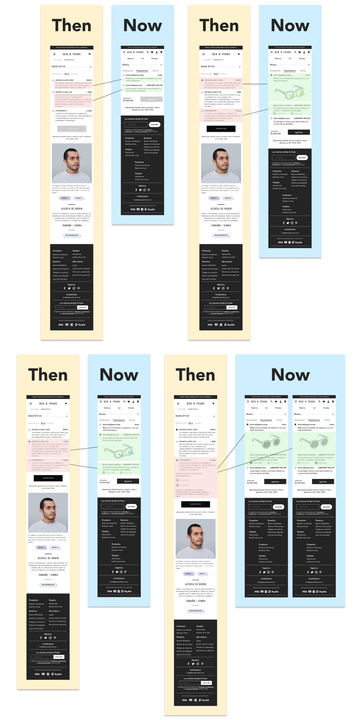
Treatments tab
Extras Tab
The Extras tab presented one of the most critical issues, as its layout generated excessive scrolling with products that had more than six color variants. To solve this, we opted for a product carousel, which optimized the available space and enabled the purchase of multiple variants.
One of the product cards includes a multiple color selection option. For this component, we based the design on the color selector definition from the PDP, with a variant for multiple selection. This allows the option to purchase more than one product within the same space.
One of the product cards includes a multiple color selection option. For this component, we based the design on the color selector definition from the PDP, with a variant for multiple selection. This allows the option to purchase more than one product within the same space.
Extras tab
Workshops with the Squad
After finalizing the proposals, I led workshops with the squad where we thoroughly analyzed the wireframes, evaluating them based on the technical effort required for each one. We categorized them into the following scale:
"Low effort (2 hours < 1 day)"
"Medium effort (2 days < 1 week)"
"High effort (< 1 week)"
We discarded options that fell into the High effort category and some from the Medium effort category.
This process allowed us to define a solution focused on meeting user needs, aligned with the OKRs, and with Jakob Nielsen's user interface usability heuristics. The technical feasibility was confirmed by the development team, and we established a release plan.
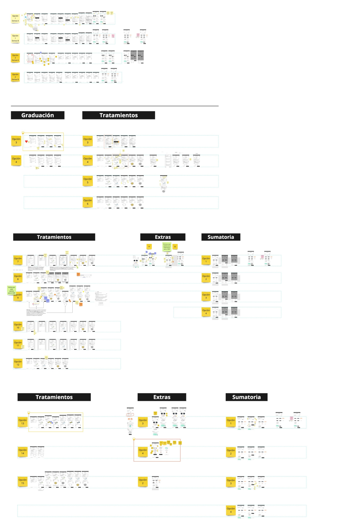
Low-Fi wireframes
Approval
Project Presentation
I prepared the necessary materials and led the project presentation to the Creative Director, Chief Marketing Officer, and Brand Manager. During the session, I received very positive feedback, their approval, and a couple of adjustments that required minimal effort from the design team.
Handoff
Development and Collaboration
I worked with the entire squad to address any questions related to the product definition, as well as to meet the needs of PM, Dev, and Q&A, while also receiving their continuous feedback. I particularly emphasize the constant communication with both frontend and backend teams, which led to a smooth implementation for development.
Sources
Magin Sesign Studio, "Los usuarios web no leen, «escanean»", https://magindesign.wordpress.com/2017/09/07/los-usuarios-web-no-leen-escanean/
Germán Jiménez, "Los usuarios sí leen", https://www.uxuarios.com/los-usuarios-si-leen-27261f34024c
Jacqueline Renouard, "The Average Time Spent On a Website: Increase Visitor Engagement", https://www.websitebuilderexpert.com/building-online-stores/average-time-spent-on-website/#:~:text=Conclusion%3A%20The%20Average%20Time%20Spent,Optimize%20site%20loading
Sirjana Dahal, "Eyes don't lie: understanding users' first impressions on website design using eye tracking", https://www.mobt3ath.com/uplode/book/book-22438.pdf
Jesse Mawhinney, “52 Visual Content Marketing Statistics You Should Know in 2024”, https://blog.hubspot.com/marketing/visual-content-marketing-strategy?__hstc=143503850.0bf9c061a76f86000c1b3172e0f66bcc.1704899742422.1704899742422.1704899742422.1&__hssc=143503850.2.1704899742422&__hsfp=129730207
Wyzow, “The Power of Visual Communication Infographic”, https://www.wyzowl.com/infographic-the-power-of-visual-communication/
Cliento, “24 estadísticas que demuestran el impacto del diseño web”, https://blog.cliento.mx/estadisticas-demuestran-impacto-diseno-web#:~:text=El%20poder%20del%20contenido%20visual,son%20el%20contenido%20m%C3%A1s%20atractivo
Special regards to Galileo's E-commerce Squad.