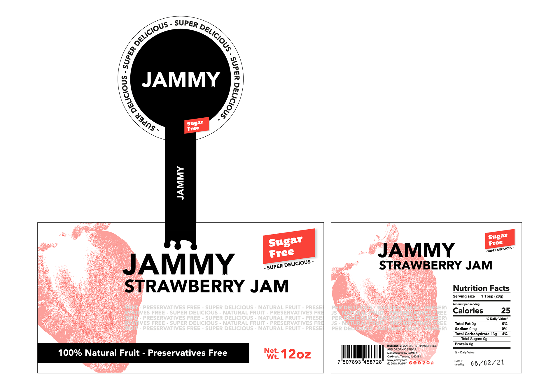
I created this project for my personal portfolio, few months ago I had a weight issue, 20 kilos overweight (yeah...) so I added daily workout in to my routine and the most important thing, I changed my nutrition. Jammy is a jam producer concept company focus on make sugar free products to keep a healthy lifestyle everyday without sacrificing a great flavor on your meals.
This jam is a delicious high fruit content and sugar free jam made with only three elements: 100% natural fruits, water and organic stevia (a zero-calorie sweetened). My jam is perfect to start a great day, you can swirl in to your morning cereal, your oatmeal pancakes or any other breakfast.
*This is my personal home made jam recipe and my morning breakfast BTW.
*This is my personal home made jam recipe and my morning breakfast BTW.
The naming process was really simple and organic because the brand needs an easy and pop name, you gonna say “jummy” if you eat a delicious meal and the product name is jam then, I mixed both words.
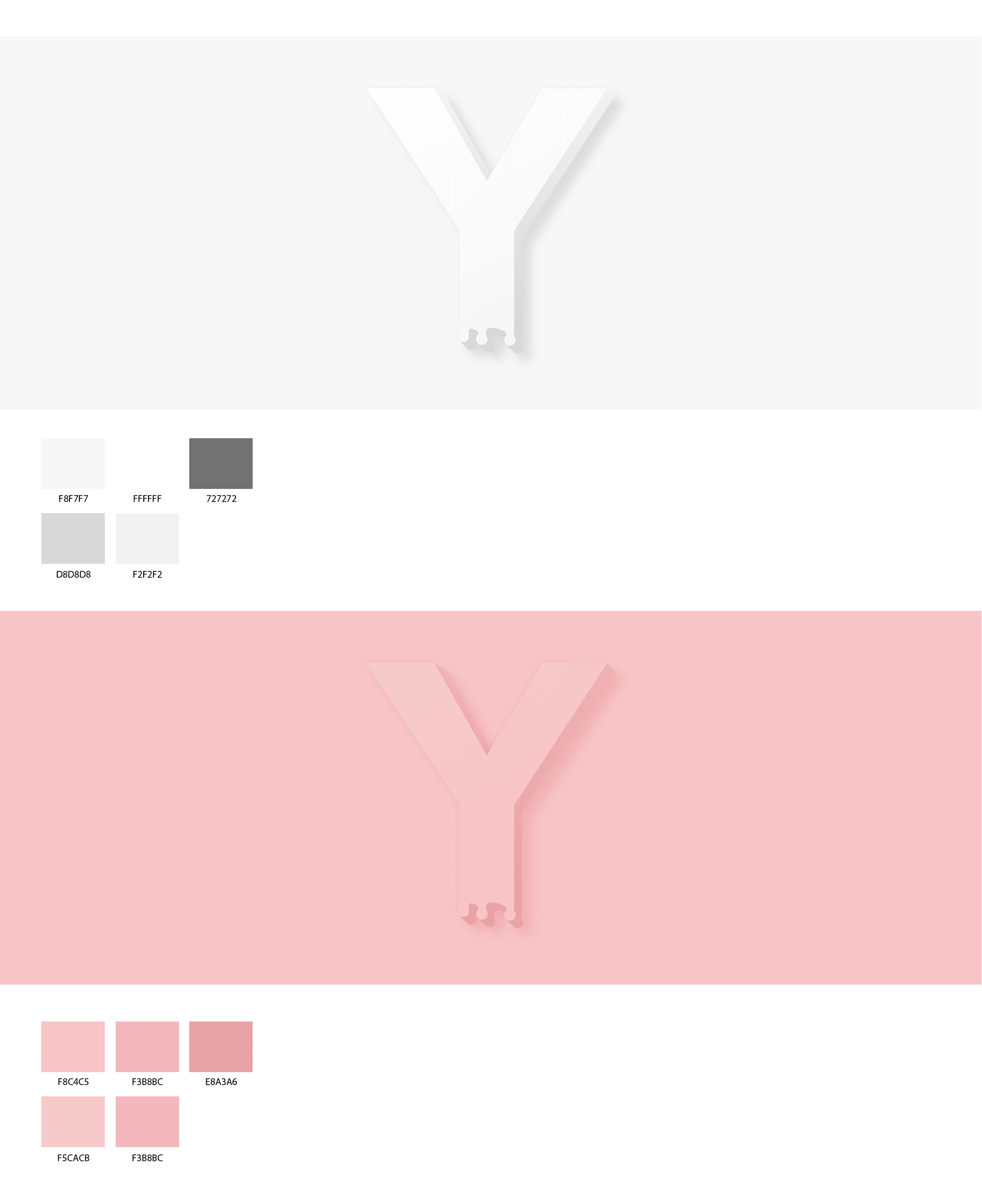
I have the target market on my mind all the time to create any brand, for this one I wanted a really clear but not boring identity so, I started with a minimalism trend (because the product are made with only 3 elements), for the logo I chose Avenir Black font and I create a little over split graphic element to placed on the “Y” letter, this element will be used as gliph.
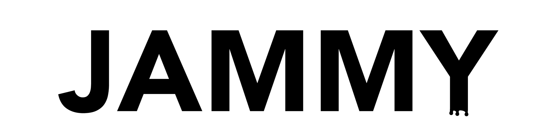
The color selection is really simple, the base is black and white to combine with the fruit color and ensure the best contrast.
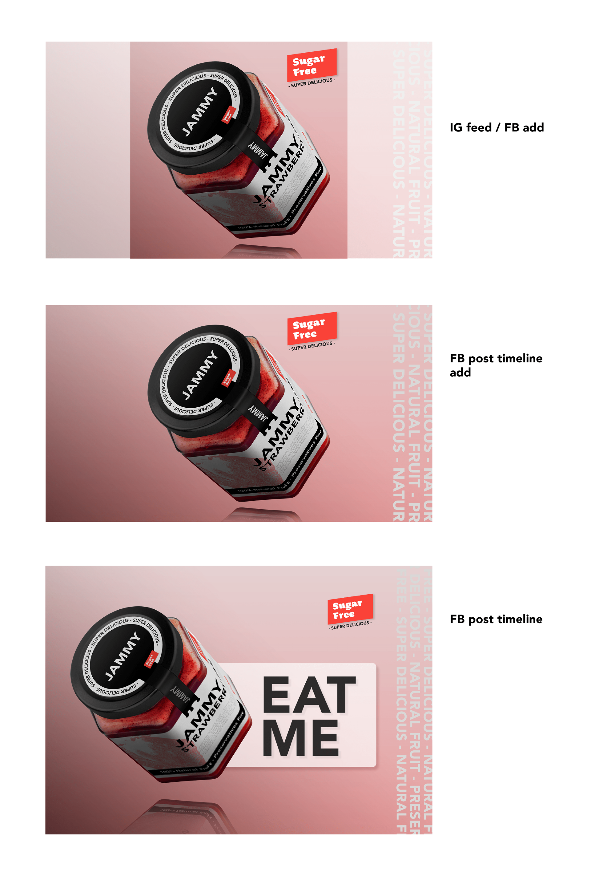
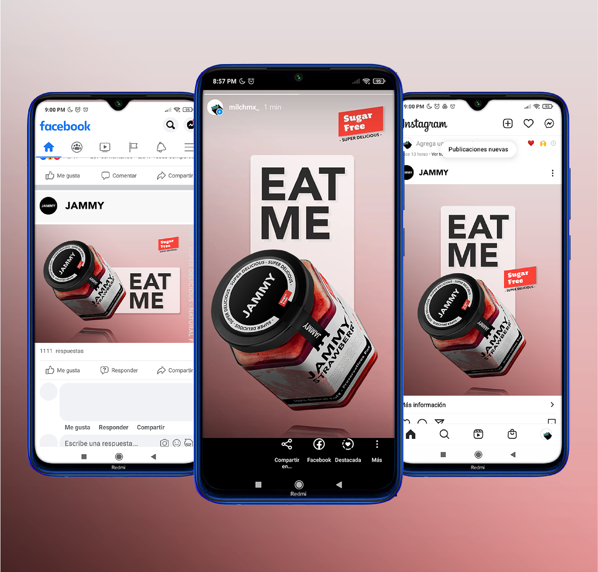
To provide a rustic and hand made feeling I inspired in risograph art, also this technique provides the option to explore transparency and superpositions and I applied this concept on the digital elements like social media adds.
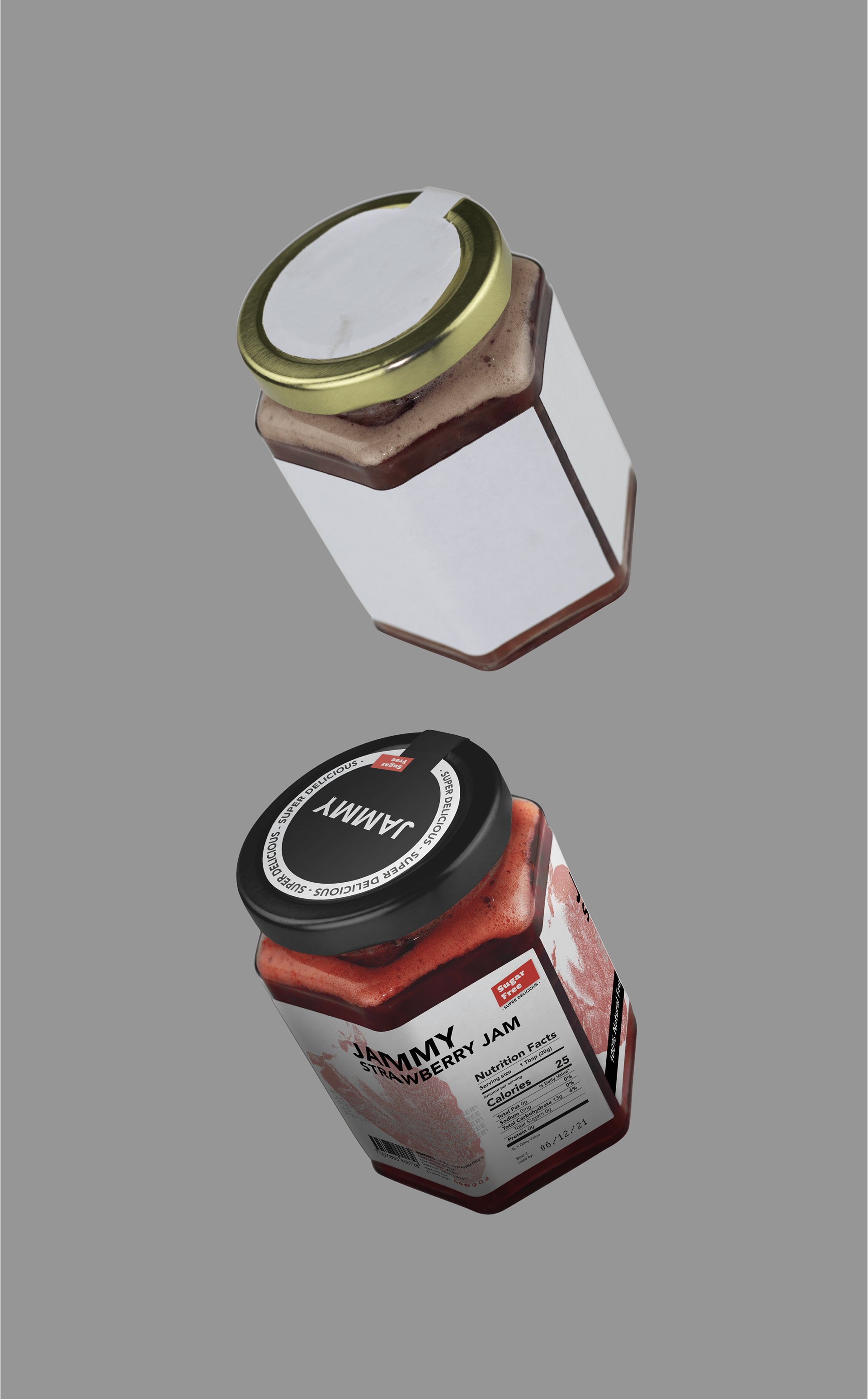
I required an specific composition on the label because the hexagonal jar shape and a big fruit image in the front, I placed the logo and headers in the middle to save space for the fruit image.
I required an specific composition on the label because the hexagonal jar shape and a big fruit image in the front, I placed the logo and headers in the middle to save space for the fruit image.
The must important concepts (Sugar Free, Super delicious and Preservatives Free) in the label need to be highlighted like the Sugar Free ribbon, the “Super Delicious” cap repetition and the middle gray text with the three concepts repetition.
To show the product and label as a real product, I made a prototype, a photo shooting and photo editing, this process allowed me to provide a clear idea for the whole concept and high quality stock images to create social media content, website content, fliers, posters and more.
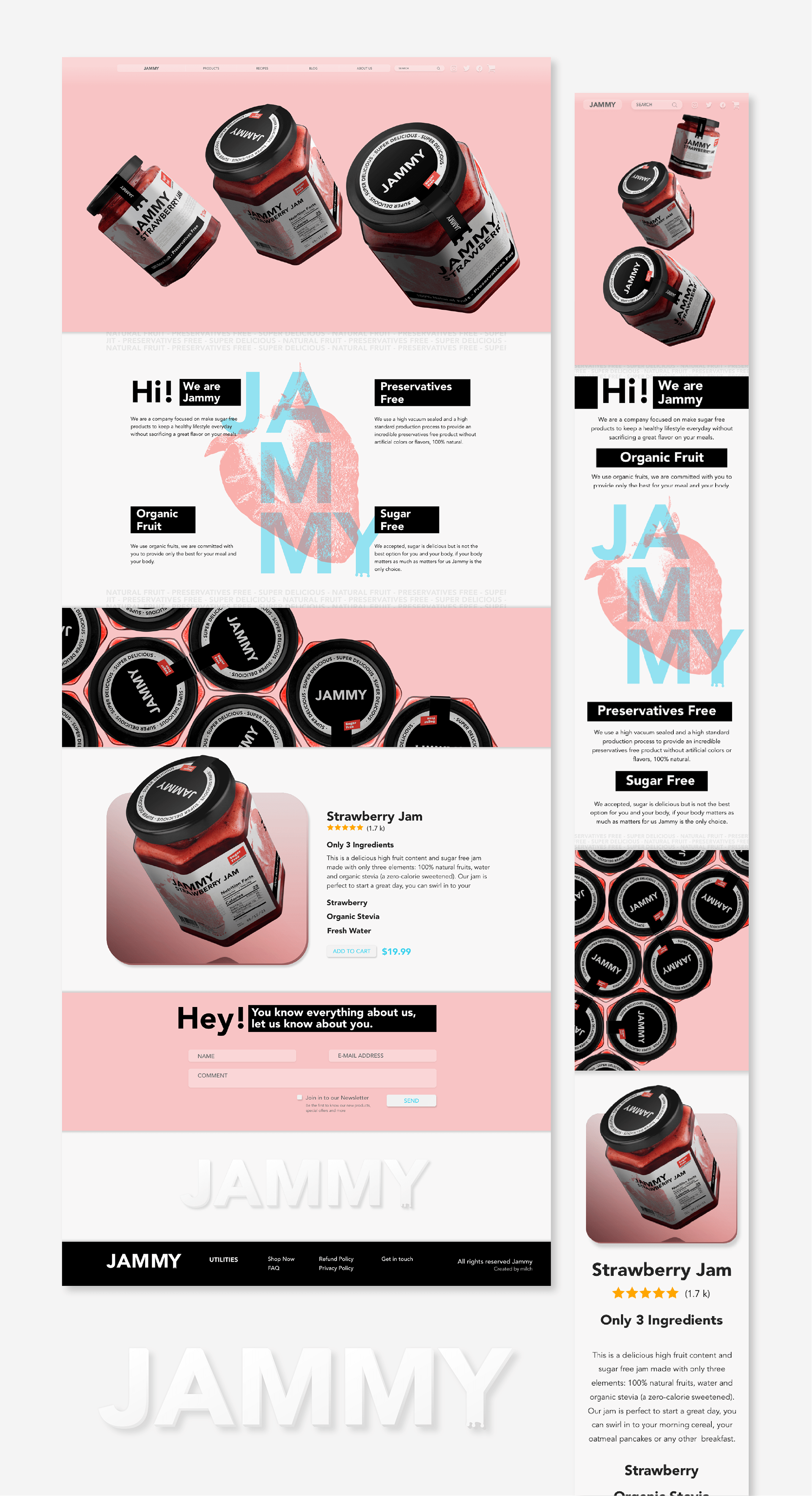
For the website concept, I introduced a bright blue in the layout to highlight the most important information. I used a light gray color in the background to make a confortable explore, when I create something I have the user in my mind all the time so I test the layout to find and fix issues. I used Adobe Xd to create the website design and please visit the the prototype:
- Mobile
- Desktop
Special thanks to Nao Mo