Case Study - Ben&Frank, PDP Redesign
Context
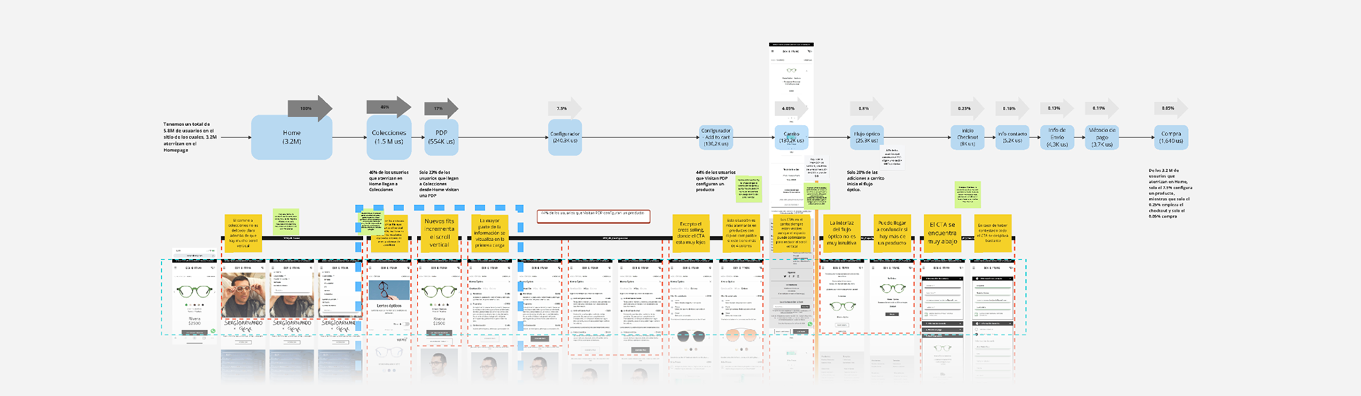
The project started with user research in which I analyzed deliverables from previous studies such as a user journey map, user interviews, drop-offs within the flow, two surveys (one conducted by marketing, the other by myself), and the diagnosis from a competitive audit.
The goal of the project was to increase micro-conversions and user engagement through a product definition where the User Interface, Information Architecture, and content respond to the current market needs, centered on the user.
My role was Product Designer, and I was responsible for leading the project by creating a work plan, executing activities in each stage of the design process, involving key figures, presenting the project to leading stakeholders, as well as providing the necessary documentation for the handoff to PM, Frontend, and Q&A. All of this was done within the Design Thinking paradigm, grounded in User-Centered and Humane Design principles, and based on the Triple Diamond framework.
Empathy & Definition
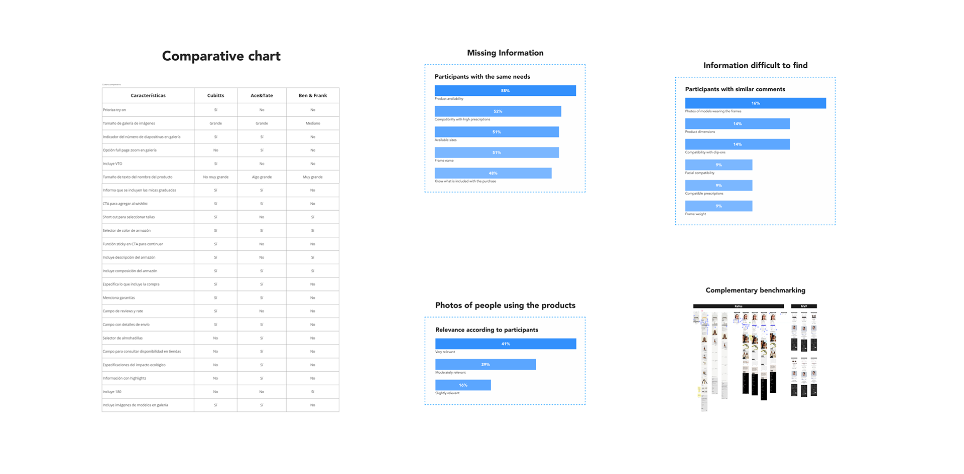
To complement the information, we initiated another study between data analysis and design, which included a competitive audit, as well as multiple findings and internal and industry-level data.
This allowed us to identify the following issues:
- Only a small portion of total sessions landing on the homepage reach the PDP.
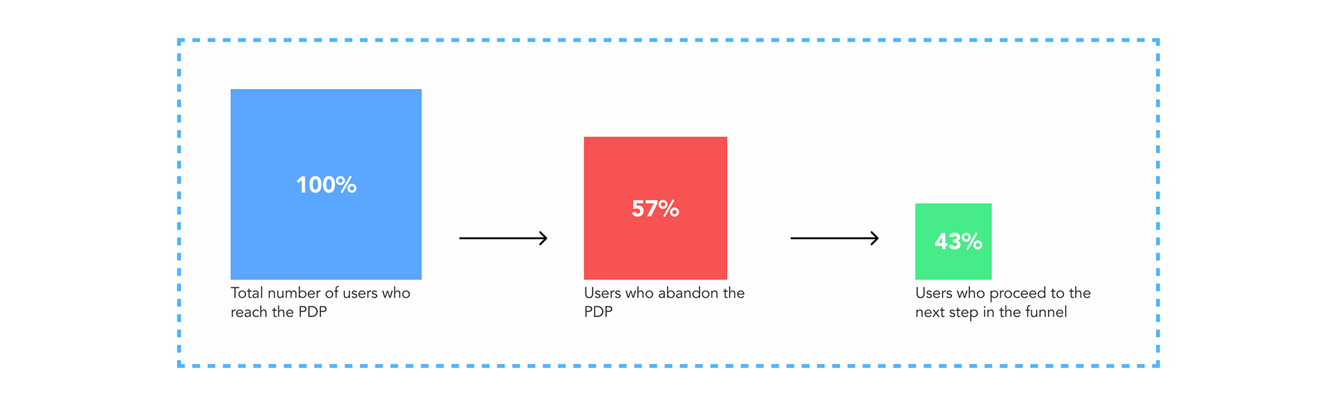
- There is a significant drop-off in sessions on the PDP.
- Low user scrolling and interaction time.
- The most commonly used resolutions and operating systems by users.
- Confusing and unintuitive interactions.
- The hierarchy of components is not user-centered.
- Difficult access to high-value technical product details for the user.
- Confusing button panel configuration in some scenarios.
- Insufficient graphical content.
- The quality of the product is not conveyed.
- The need to catch up with the industry in order to innovate.
This allowed us to identify the following issues:
- Only a small portion of total sessions landing on the homepage reach the PDP.
- There is a significant drop-off in sessions on the PDP.
- Low user scrolling and interaction time.
- The most commonly used resolutions and operating systems by users.
- Confusing and unintuitive interactions.
- The hierarchy of components is not user-centered.
- Difficult access to high-value technical product details for the user.
- Confusing button panel configuration in some scenarios.
- Insufficient graphical content.
- The quality of the product is not conveyed.
- The need to catch up with the industry in order to innovate.
Existing Knowledge
Ideation & Prototyping
Information Architecture
I began the ideation phase by conducting a Crazy 8s exercise, complementing its outcome with information from a chart listing the necessary features to match industry standards, along with the findings from the research.
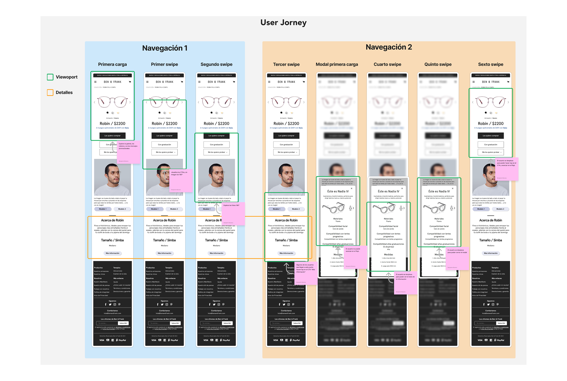
User Jorney
This is how I defined a user-centered information architecture:
- Relocate the image gallery to the first position to make it the main focus.
- Prioritize and group the product name and price in a single block.
- Integrate elements to achieve consistency and uniformity.
- Optimize space by prioritizing mobile devices.
- Include a text box for a small promotional copy.
- Group and prioritize the components of the color, polarization, and size selectors.
- Prioritize and include a text box for important notices.
- Simplify and prioritize the button section.
- Prioritize and organize the information that users consider relevant.
- Include cross-selling and a new arrivals banner to keep users engaged.
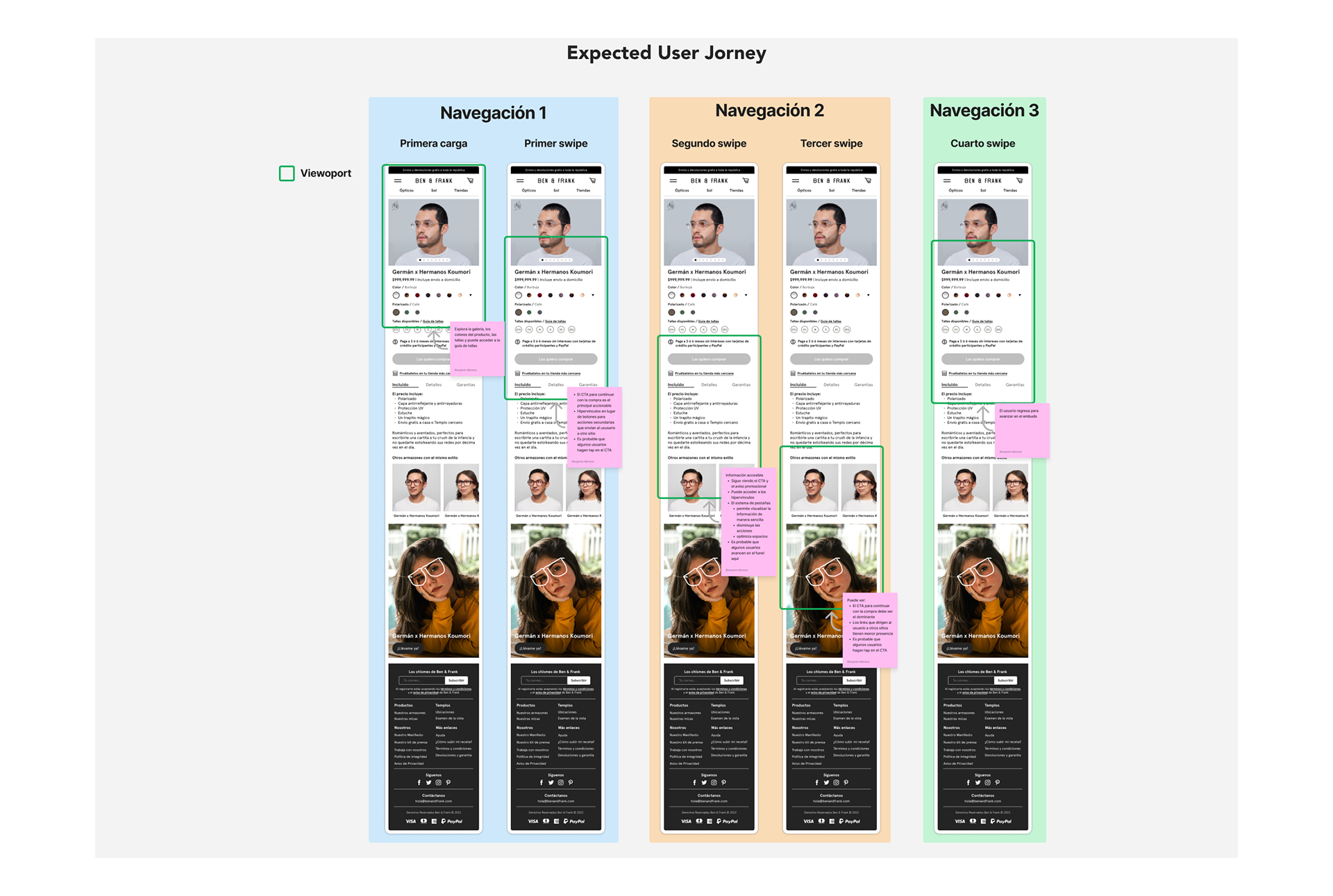
Expected User Jorney
The next exercise was mapping the scenarios faced by users of each Business Unit to define the edge case for each collection. These were used as a basis (along with Jacob Nielsen's interaction heuristics) when conceptualizing the wireframes.
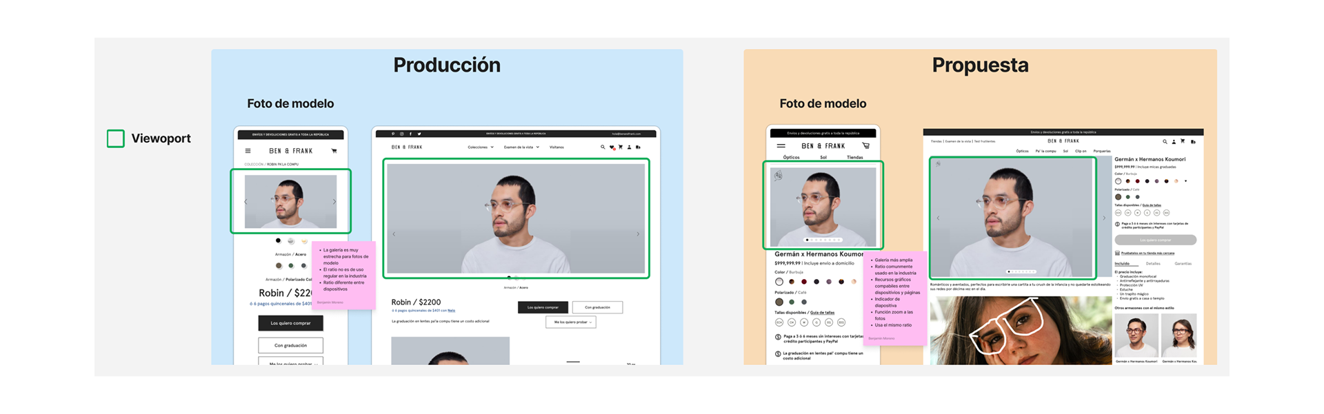
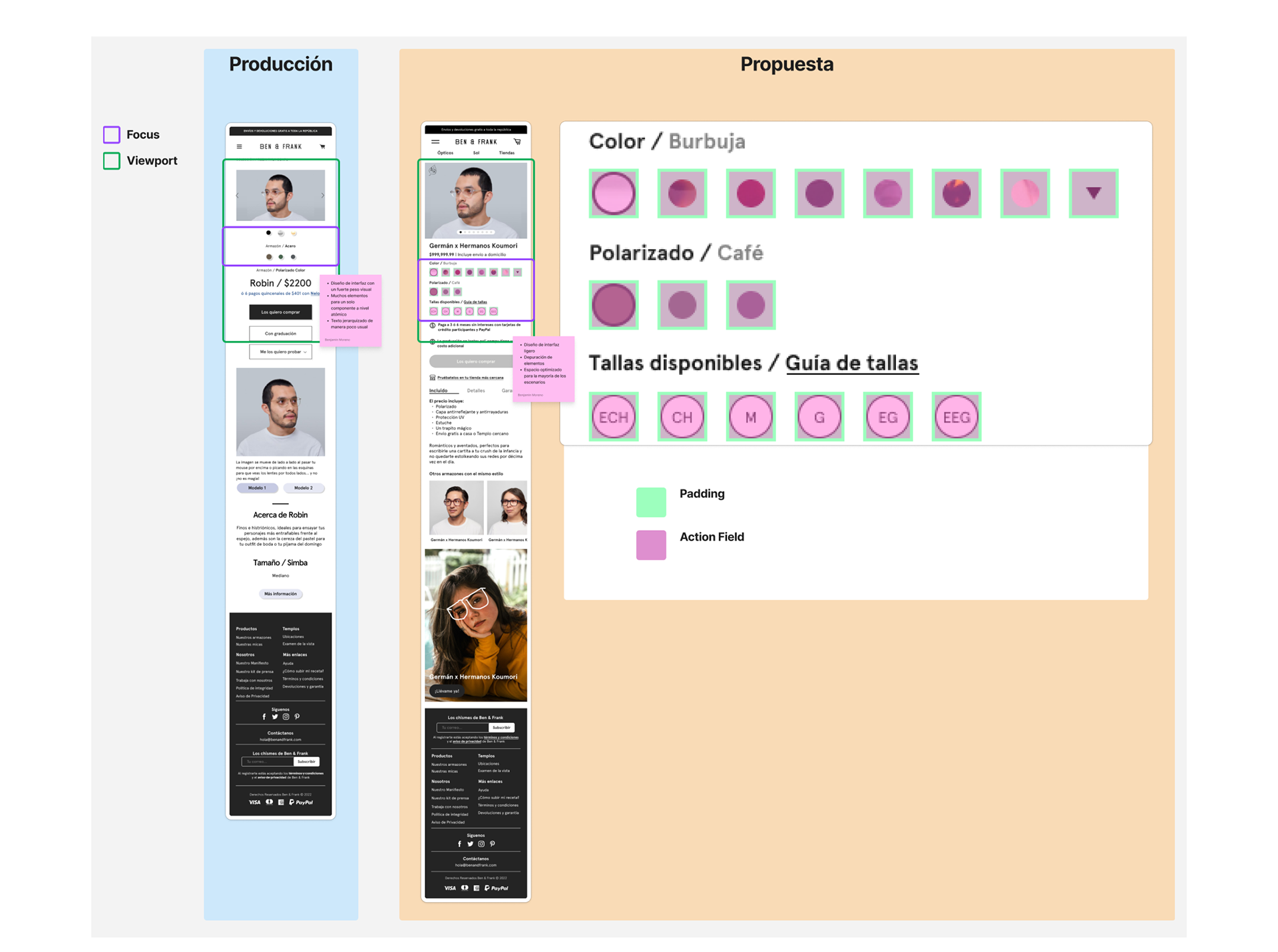
Product Photo Gallery
One of the main needs of users is to see people using the products, and the only section that had something similar was near the footer. This created a painful journey as the user had to scroll to the bottom of the page and then back up to choose their product.
Therefore, the main gallery needed to include model photos. To achieve this, the ratio was modified in both resolutions, from the original 1.73:1 (not recommended as it does not allow a proper view of a model photo due to its narrowness) to a 4:3 ratio, which is commonly used in the industry as it is wide and allows proper viewing of model photos.
Production VS Proposal
It was also necessary to include a couple of standard components in the industry. One of them is the slide indicator, which provides clarity to the user, and the zoom function, which allows users to appreciate product details, aiming to convey the product's quality to users.
Additionally, I created a manual and an editable template with the technical guidelines needed for product photos, reducing complexity for development and ensuring the compatibility of graphic material generated by branding across both portrait and landscape formats.
Additionally, I created a manual and an editable template with the technical guidelines needed for product photos, reducing complexity for development and ensuring the compatibility of graphic material generated by branding across both portrait and landscape formats.
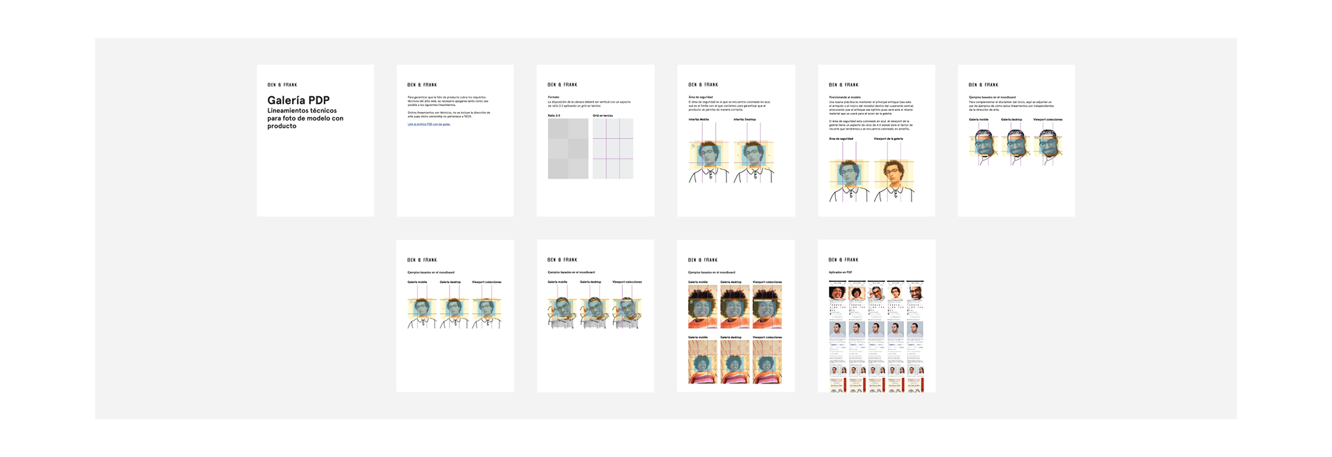
Technical Aspects Manual
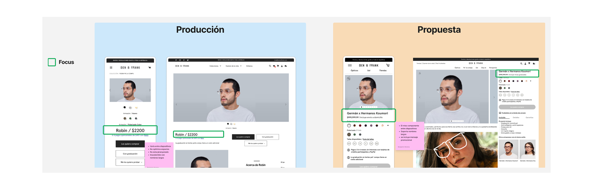
Product Name and Price
The product name and price were quite large, and they were arranged and placed in a less than ideal manner.
To fix this, it was necessary to group the elements into a single molecule, prioritize both texts by adjusting the font size and weight, using bold for the name and regular for the price. Additionally, we maximized the space by using the leftover area to display a small promotional text and, during promotional seasons, indicate the discounted price.
To fix this, it was necessary to group the elements into a single molecule, prioritize both texts by adjusting the font size and weight, using bold for the name and regular for the price. Additionally, we maximized the space by using the leftover area to display a small promotional text and, during promotional seasons, indicate the discounted price.
Product Name & Price
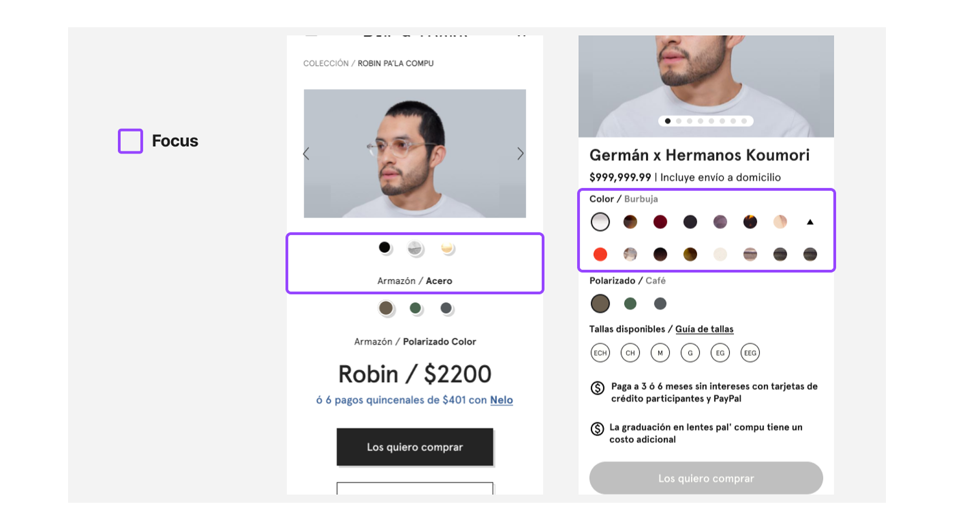
Color and Size Selectors
The user interface of this page needed to be more intuitive and usable, so the new definition was made following the Atomic Design Paradigm at all levels, starting with the atomic level.
Atomic level
The definition of headers consists of a font with the same weight and size, prioritized by color, using black for the first text element and gray for the second. We also used the same criteria for the headers of polarization and size.
The container and action rate of the "color swatch" and "size swatch" were adjusted to 32x32px, and the visual weight was reduced by omitting the shadow effect. The circular graphic maintained its alignment (centered on both axes) and renders images for color and polarization selectors, or text for the size selector.
Production VS Proposal Swatch Structure
The guidelines for the "color swatch" are defined based on the two states of the component:
- The "selected" state, the swatch has a diameter of 28px and an internal black outline with a thickness of 2px.
- The "unselected" state, the color swatch has a diameter of 20px with no outline.
- The "size swatch", the swatch diameter is 28px and is used in all three states of the component:
- The "selected" state, the swatch is black with no outline, and the central text is white with a bold weight.
- The "unselected" state, the swatch has a white fill, an internal black outline with a thickness of 2px, and central text that matches the outline color using a regular weight font.
- The "unable" state, the swatch is light gray with a dark gray outline with a thickness of 2px, and central text that matches the outline color using a regular weight font.
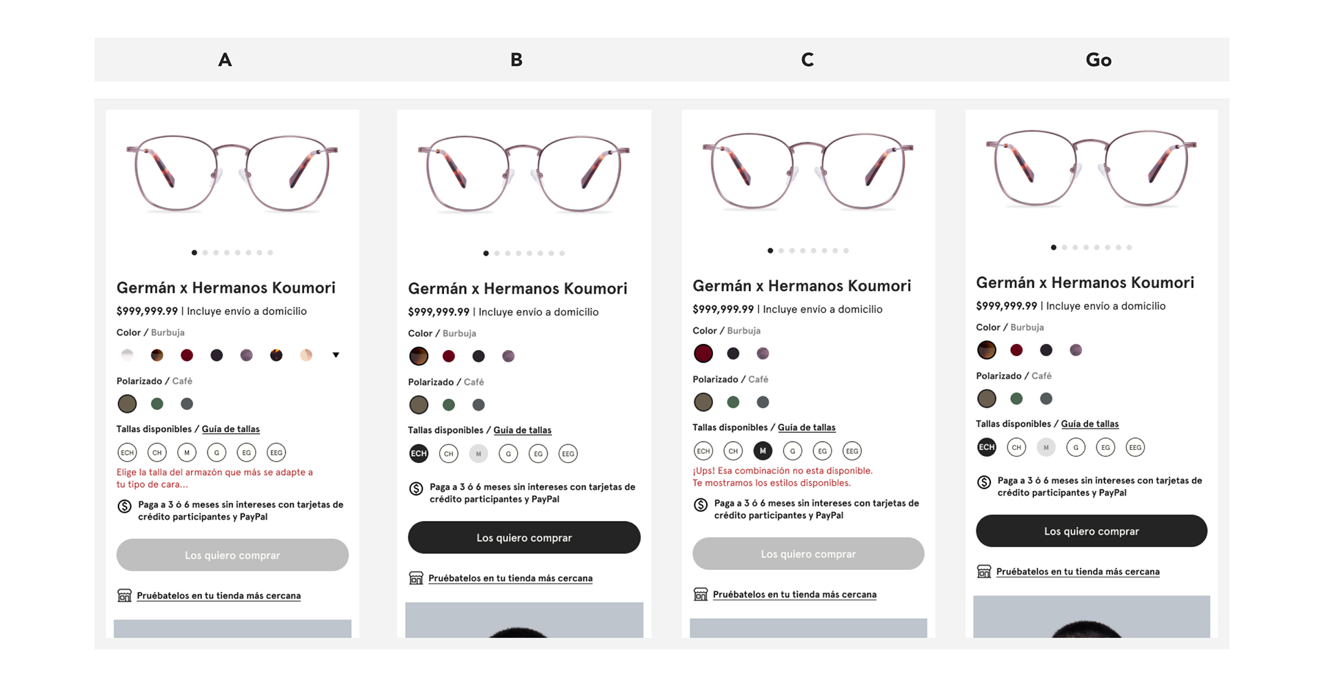
Molecular level
The definition of color and polarization selectors requires a dynamic component that varies based on the number of "color swatches" the product has and the device resolution. It can display all product colors statically or behave like an accordion.
The molecule behaves like an accordion whenever the total number of colors exceeds the number of "color swatches" that fit in one row. When this happens, the rightmost "color swatch" is replaced by a "chevron" that, when clicked by the user, displays the remaining colors in a lower row.
Swatch Accordion
Organism level
The definition is based on the combination selected by the user, which can present three different scenarios:
- Scenario A: If the user's first selection is the color, the sizes are filtered, rendering available sizes in the able state and unavailable sizes in the unable state.
- Scenario B: If the user's first selection is the size, the colors are filtered, rendering only the colors available in the selected size.
- Scenario C: When the user has selected a combination of color and size, if the user selects a size that is not available, the feedback system is activated, and the message "Oops! That combination is not available. We are showing you the available styles." is rendered.
Feedback System
Auxiliary Informational Message
To effectively communicate promotions or important information, it was necessary to define an element capable of attracting the user's attention. The result was a molecule composed of an icon accompanied by a text box that can contain a message with a maximum length of two lines.
Auxiliary Informational Message
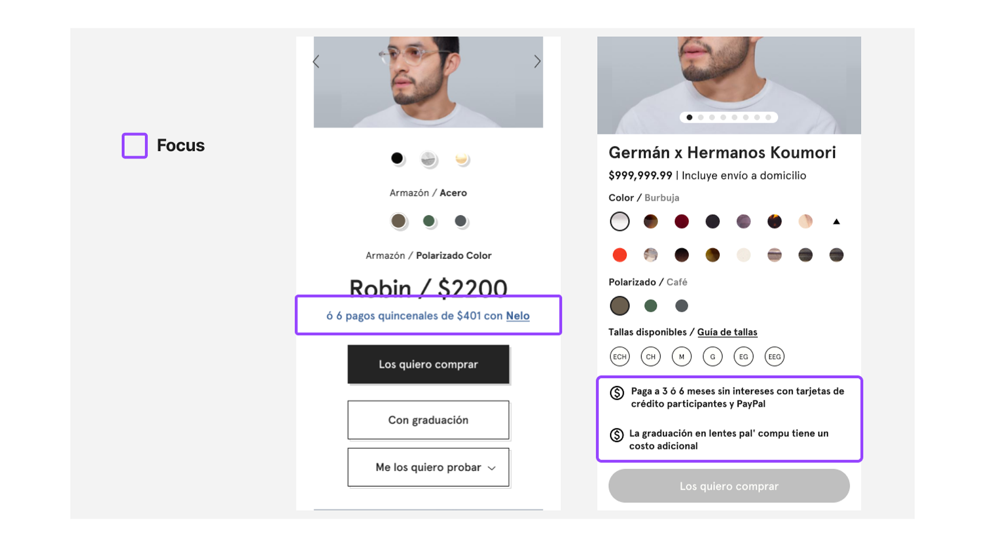
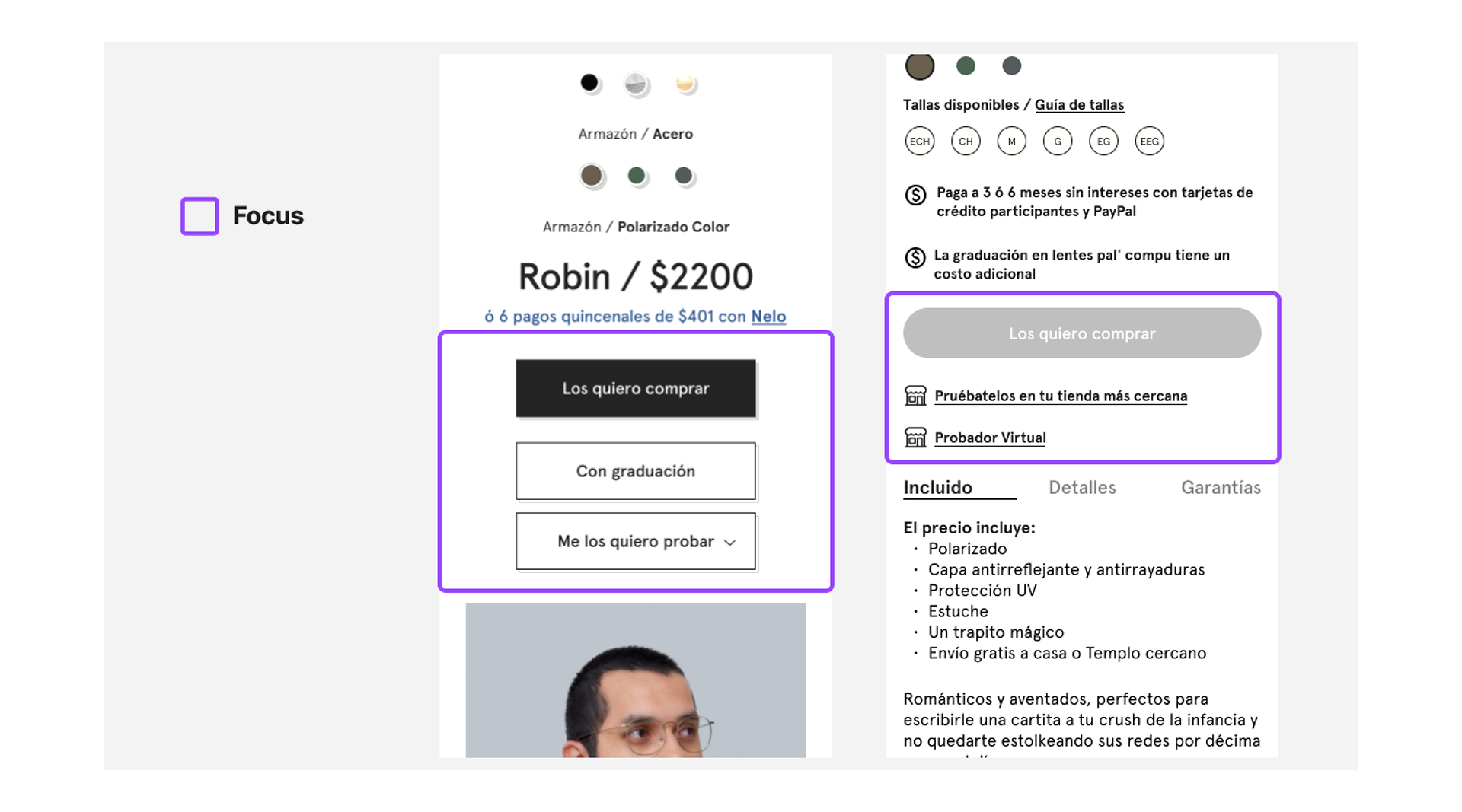
Button Panel
The new panel needed to solve the button distribution issue and include a couple of additional buttons: one for adding the product to a wishlist and another for easily sharing the URL across multiple platforms.
To define the morphology and organization of the components, it was necessary to analyze the behavior of each element and conduct a prioritization exercise. The result was a molecule with three atoms: a primary button that allows users to proceed with the purchase flow, a button to add the product to the wishlist, and a button to share the product URL.
The morphology of the other two buttons was changed to hyperlinks since they direct users to other sections of the site and are of lesser relevance.
Buton Panel Rearrangement
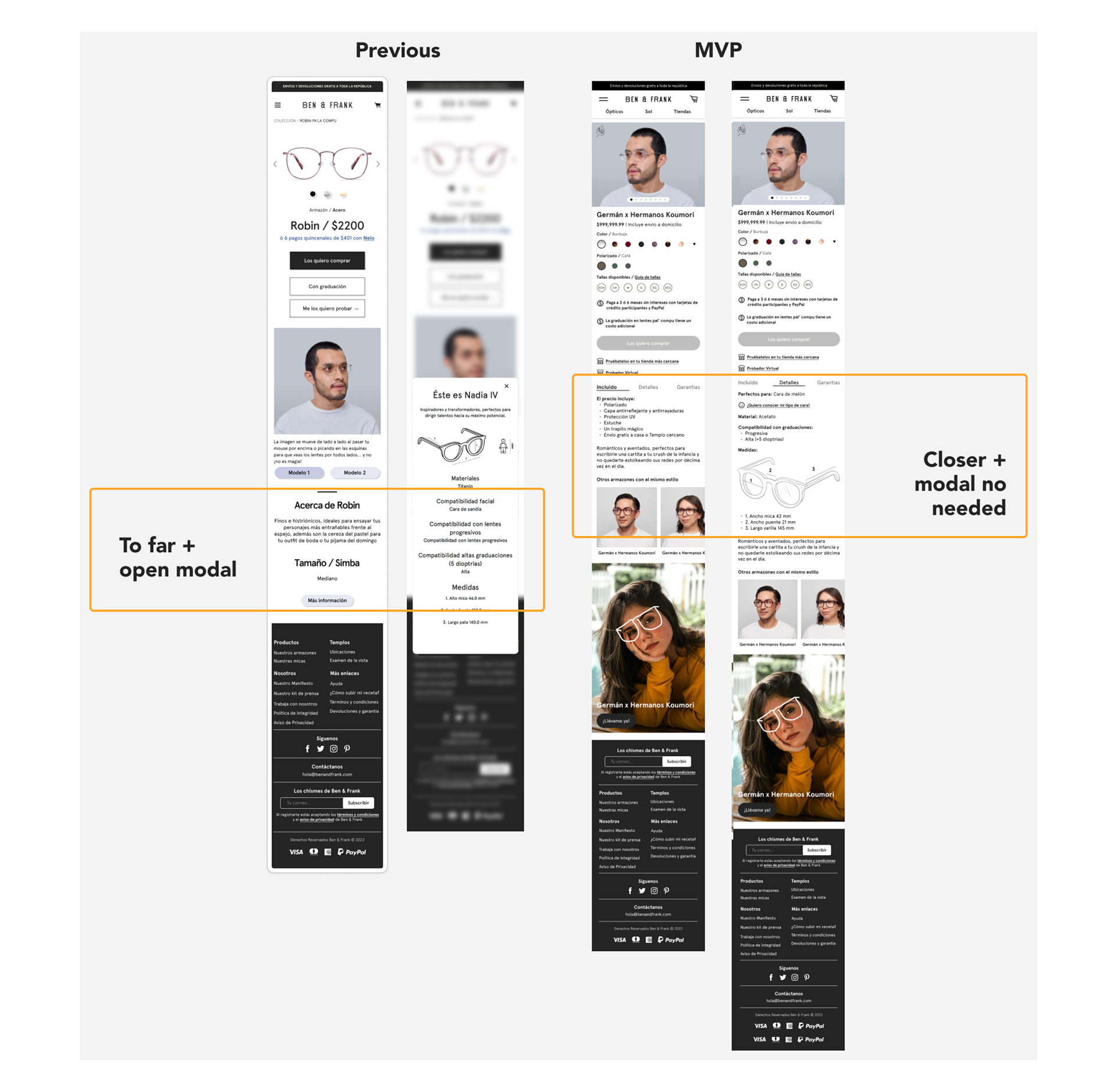
Tab Panel
The information that users consider necessary to decide which product to buy was not easily found. To solve this, it was necessary to gather all the information and divide it into three categories (Included, Details, and Guarantees) to organize it in a tab panel. This reduces the number of clicks for the user and makes the information easy to locate.
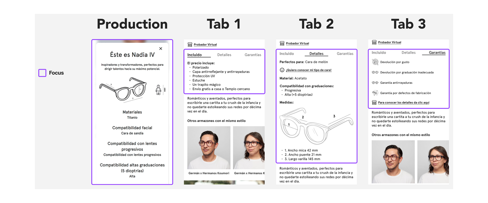
Tabs System
Distance Traveled by the User
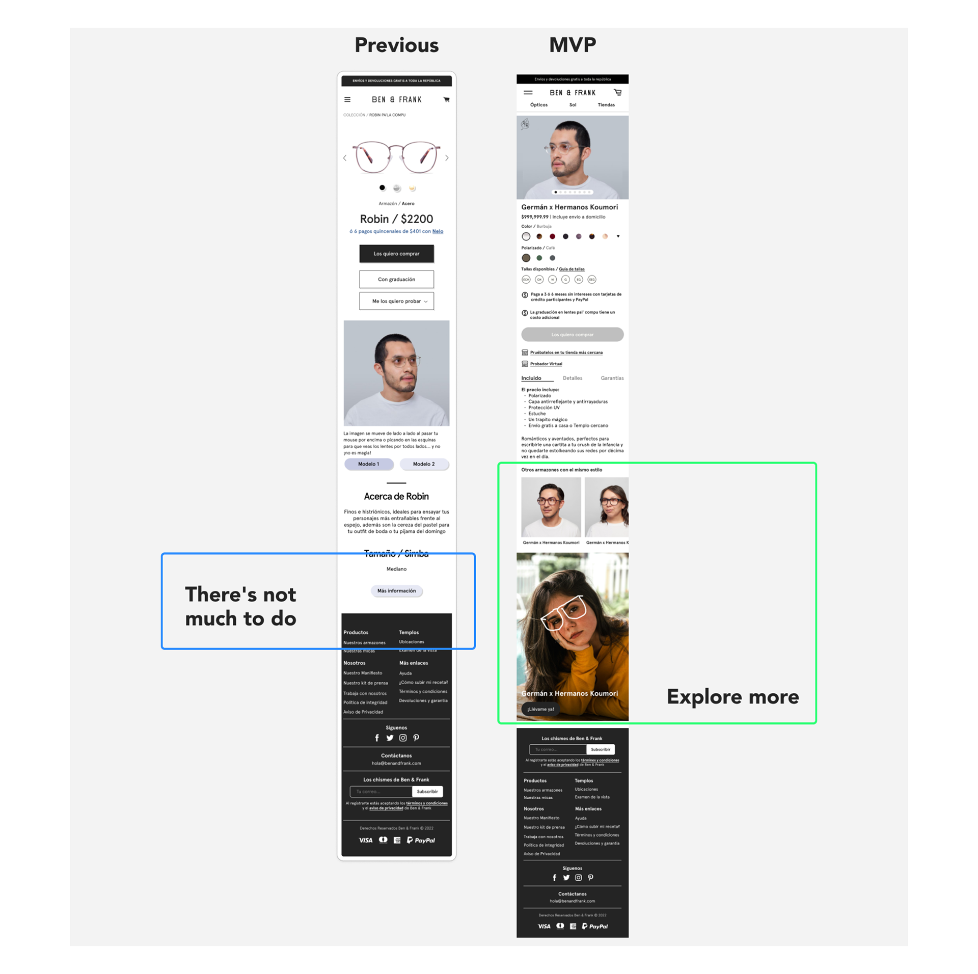
Recommendation Carousel
To increase user engagement and help them find their ideal product, we conceptualized a carousel that renders the five best-selling products sharing the "face type" attribute. It was implemented easily through Bloomreach.
New Arrivals Banner
New Arrivals Banner
To increase user engagement and promote products that may interest them, we included a new arrivals banner for various topics. This banner can push entire collections or specific products.
To ensure the new banner definition meets the objectives, it was necessary to analyze both portrait and landscape formats to define proportions that guarantee the correct visualization of graphic material and the optimization of these resources into technical guidelines that ensure compatibility of photographic material between both formats.
To ensure the new banner definition meets the objectives, it was necessary to analyze both portrait and landscape formats to define proportions that guarantee the correct visualization of graphic material and the optimization of these resources into technical guidelines that ensure compatibility of photographic material between both formats.
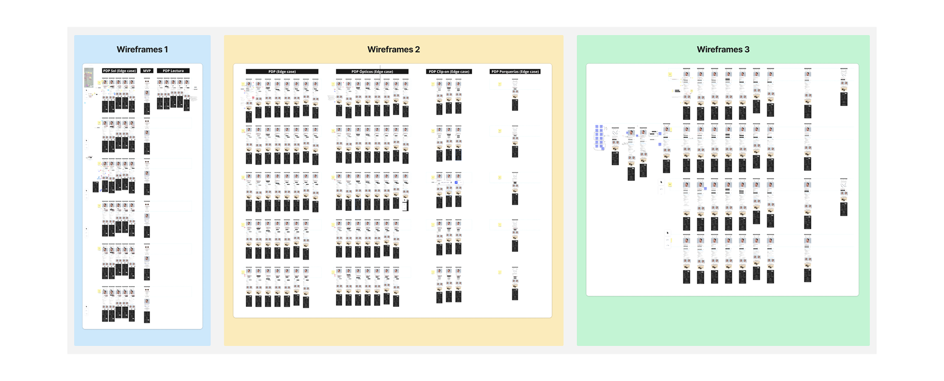
Wireframes Stages
Approval
Project Presentation
I prepared the necessary materials and led the project presentation to the Creative Director, Chief Marketing Officer, and Brand Manager. During this session, I received very positive feedback, their approval, and a couple of adjustments that required minimal effort from the design team.
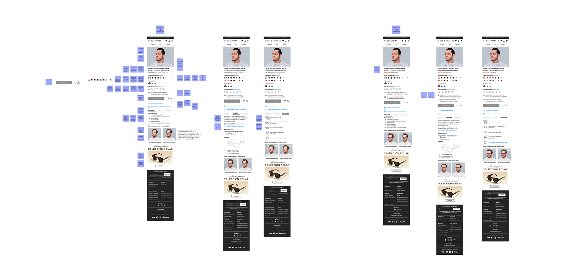
Final Proposal
Iteration
Between the Product Manager, Product Designer, Tech Lead, Frontend, and Data Analyst, it was determined that the PDP would be released to production with a reduced scope, omitting the wishlist and sharing functions because another squad is developing them. These features will be added in future value increments.
Handoff
Development and Collaboration
I worked with the entire squad to resolve questions related to product definition, as well as to meet the needs of PM, Dev, and Q&A, and receive their constant feedback. I emphasize the continuous communication with frontend and backend, which led to a clean implementation for development.
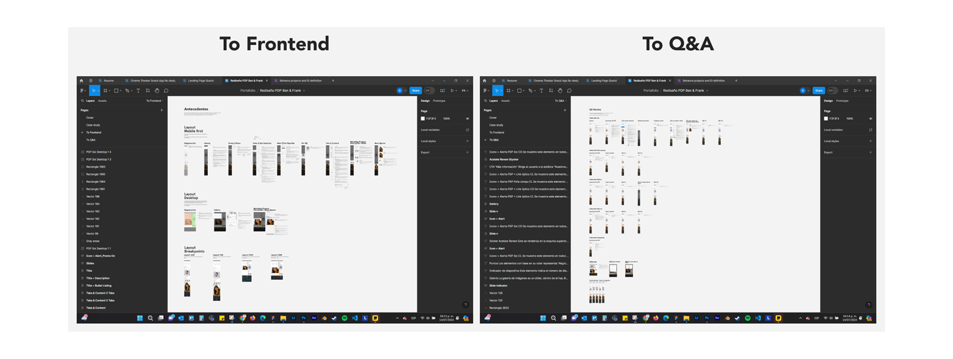
Handoff Documentation
Challenges and Solutions
The main challenge was within the design chapter, as the generated documentation was not adequate for the squad. It presented many issues such as being multiplatform, not standardized, and using deprecated practices and concepts in the industry.
Therefore, I implemented best practices aimed at different team members, which served as the basis for the Design Doc created by the frontend architecture. I included the "acceptance criteria" format to define the behavior of the components, as it is an industry-standardized format understood by all areas of the squad except design.
I also created a section with technical definitions focused on frontend development, implementing best practices such as meticulous specifications of components, creating components through nested containers, defining layout proportions to ensure compatibility and content optimization across multiple resolutions, and establishing paddings and breakpoints based on the parameters of the frontend framework (Tailwind CSS).
Additionally, I facilitated the Q&A review by providing colloquial descriptions of component behavior and the representation of specific scenarios.
See the page here: https://www.benandfrank.com/shop/product/optical/parksoptico?variant=PARKBF-CN
Special regards to Galileo's E-commerce Squad.